The heat kernel on the sphere
Every other check in these tutorials compares the simulation against a summary statistic: a mean, a histogram, a growth rate. The heat kernel lets you compare it against the exact answer, point by point, at every time.
The heat kernel p(t, x, y) is the probability density of finding a particle
at y at time t given that it started at x. On the unit sphere it is
known in closed form, so simulating it and evaluating the formula should give
the same function. This page does both and compares them.
Requires SciPy
wanderwalk.heat_kernel uses SciPy, which the numpy-only core install
does not pull in. Install the notebooks extra first:
Because of that, this module is deliberately not re-exported at the top
level. ww.heat_kernel will not resolve; import it by path.
The three functions
from wanderwalk.heat_kernel import (
    estimate_heat_kernel,
    estimate_density,
    estimate_theoretical_heat_kernel,
)
| Function | Job |
|---|---|
estimate_heat_kernel() |
Runs 2000 paths from the north pole and records positions at t = 0.1, 0.5, 1.0, 2.0. |
estimate_density(samples, time_index) |
Turns those positions into a properly normalized density on a spherical grid. |
estimate_theoretical_heat_kernel(theta_grid, phi_grid, t) |
Evaluates the exact analytic kernel on the same grid. |
estimate_heat_kernel takes no arguments; its parameters are fixed so the
comparison is reproducible. It runs a single-particle loop rather than
calling ww.sphere_simulator, so the samples come from the same
euler_maruyama_step the manifold exposes.
import numpy as np
from wanderwalk.heat_kernel import estimate_heat_kernel

np.random.seed(0)
samples = estimate_heat_kernel()

print("samples shape:", samples.shape)
The axes are [path, time, coordinate], with the time axis indexing
t = 0.1, 0.5, 1.0, 2.0 in that order.
Normalizing on a curved surface
estimate_density is where the geometry enters. A naive kernel density
estimate over (theta, phi) would treat those two angles as if they were
Cartesian coordinates, which they are not: a rectangle of angles near the
pole covers far less area than the same rectangle near the equator.
The fix is to normalize with the sphere's area element,
sin(theta) d(theta) d(phi), and that is what the function does. The result
genuinely integrates to 1 over the surface:
import numpy as np
from wanderwalk.heat_kernel import estimate_density

theta_grid, phi_grid, density, dtheta, dphi = estimate_density(samples, 1)

integral = np.sum(density * np.sin(theta_grid)[:, None] * dtheta * dphi)
print("grids:", theta_grid.shape, phi_grid.shape, " density:", density.shape)
print("integral over the sphere:", round(float(integral), 6))
This is the difference between estimate_density and
ww.sphere_kde. sphere_kde normalizes so the
peak is 1, which is what you want for a heatmap. estimate_density
normalizes so the integral is 1, which is what you need to compare against a
probability density.
The dtheta and dphi it returns are the grid spacings, handed back so you
can integrate without recomputing them.
The analytic answer
The heat kernel from the north pole depends only on the polar angle, and expands in Legendre polynomials:
l(l+1) are the eigenvalues of the Laplace-Beltrami operator on the sphere.
The series is truncated at l = 50.
The factor of one half in the exponent
That /2 is this project's generator convention: Brownian motion is the
diffusion generated by (1/2) Laplacian, as
ONBOARDING.md sets out. Many references state this
expansion as exp(-l(l+1)t), using the generator Laplacian instead.
Their t is half of this one. If you compare wanderwalk output against a
formula from elsewhere and find everything off by a factor of two in
time, this is why.
As t grows the sum collapses to its l = 0 term and the kernel flattens to
the uniform density 1 / (4 pi):
import numpy as np
from wanderwalk.heat_kernel import estimate_theoretical_heat_kernel

theta = np.linspace(0, np.pi, 50)
phi = np.linspace(0, 2 * np.pi, 50)

for t in (0.5, 2.0, 20.0):
    kernel = estimate_theoretical_heat_kernel(theta, phi, t)
    print(f"t = {t:5}   min {kernel.min():.5f}   max {kernel.max():.5f}")

print("uniform density 1 / (4 pi):", round(1 / (4 * np.pi), 5))
t =   0.5   min 0.00020   max 0.34623
t =   2.0   min 0.04825   max 0.11288
t =  20.0   min 0.07958   max 0.07958
uniform density 1 / (4 pi): 0.07958
Putting them side by side
Both functions return arrays indexed [theta, phi]. The kernel does not
depend on phi, so averaging over that axis reduces each to a curve in
theta that can be compared directly:
import numpy as np
from wanderwalk.heat_kernel import estimate_density, estimate_theoretical_heat_kernel

for time_index, t in [(0, 0.1), (1, 0.5), (2, 1.0), (3, 2.0)]:
    theta_grid, phi_grid, empirical, _, _ = estimate_density(samples, time_index)
    theoretical = estimate_theoretical_heat_kernel(theta_grid, phi_grid, t)

    empirical_curve = empirical.mean(axis=1)
    theoretical_curve = theoretical.mean(axis=1)
    rms = np.sqrt(np.mean((empirical_curve - theoretical_curve) ** 2))

    print(f"t = {t:4}   rms difference {rms:.5f}")
t =  0.1   rms difference 0.12192
t =  0.5   rms difference 0.02313
t =  1.0   rms difference 0.01058
t =  2.0   rms difference 0.00300
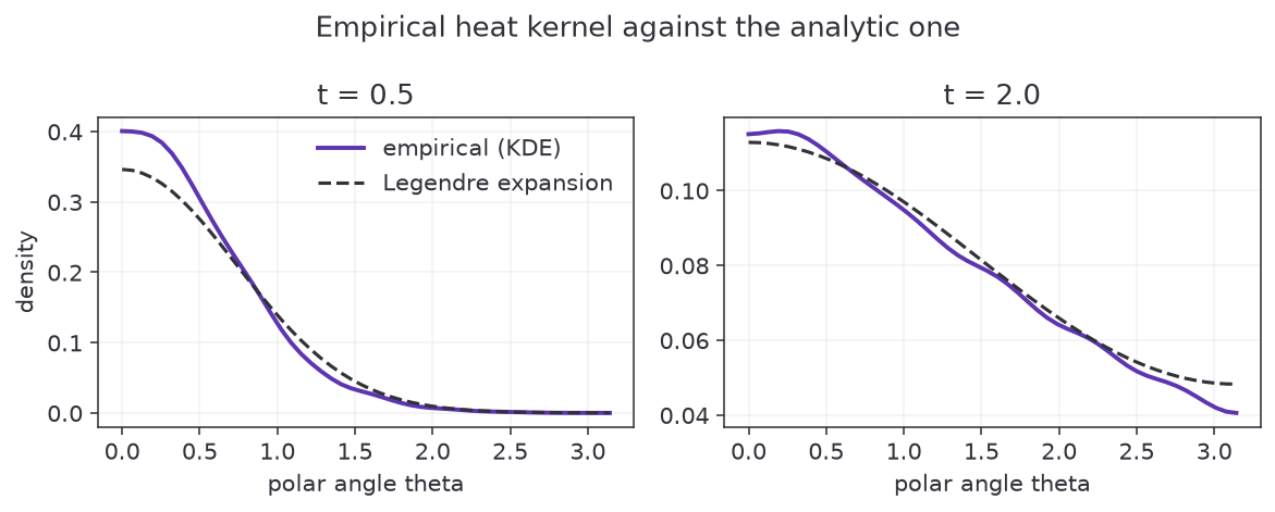
The agreement improves by a factor of forty from t = 0.1 to t = 2.0, and
the reason is worth understanding: the error is dominated by the density
estimate, not by the simulation.
At t = 0.1 the particles are still packed into a tiny cap around the north
pole, and estimate_density fits a Gaussian kernel in ambient R^3 with an
automatically chosen bandwidth. That bandwidth is far wider than the cap, so
the estimate is smeared out and the peak is badly underestimated. As the
particles spread, the true density becomes broad compared to the bandwidth
and the bias disappears.
So a large residual at small t is a statement about kernel density
estimation, not evidence that the simulator is wrong. To probe short times
properly you would need more paths and a narrower bandwidth.
Drawing the comparison
import matplotlib.pyplot as plt
import numpy as np
from wanderwalk.heat_kernel import estimate_density, estimate_theoretical_heat_kernel

fig, axes = plt.subplots(1, 2, figsize=(9, 3.5))

for ax, (time_index, t) in zip(axes, [(1, 0.5), (3, 2.0)]):
    theta_grid, phi_grid, empirical, _, _ = estimate_density(samples, time_index)
    theoretical = estimate_theoretical_heat_kernel(theta_grid, phi_grid, t)

    ax.plot(theta_grid, empirical.mean(axis=1), linewidth=2, label="empirical (KDE)")
    ax.plot(theta_grid, theoretical.mean(axis=1), "--", label="Legendre expansion")
    ax.set_xlabel("polar angle theta")
    ax.set_title(f"t = {t}")

axes[0].set_ylabel("density")
axes[0].legend()
plt.show()
notebooks/Notebook-04.ipynb works through the same comparison in more
detail, including two-dimensional heatmaps over (theta, phi) rather than
the phi-averaged curves above.
What next
- Reproducibility and performance, on seeding
and on picking
dt,T, andN. - The heat kernel API reference.